Bedroom makeover, olive and a hint of 70's
Hi guys, it has been a while since I wrote a new blog! If you follow me on social media you might have seen bits of the master bedroom makeover, I tried to show the reality of doing a room up. Not the Insta magic of clap your hands and its done, my absolute pet peeve! But the real time it takes to do up a room. Most people can’t just put all their time into a room makeover, it takes a lot longer then just a few days as most have us have other jobs, a family or just life that gets in the way.
I have posted several reels about peeling the wallpaper away (a very slow process!) painting the whole room and wallpapering the office. The bed build and final finishing touches will be a Youtube video soon(ish) but I couldn’t wait sharing the olive green room with you as I absolutely love it.
Just look at the difference!
The before and after of the master bedroom
We lived with the floral wallpaper, bed that didn’t fit in the room, weird green carpet and lots of little cupboard doors for over 8 months. The master bedroom wasn’t very high on my to do list as I wanted to concentrate on the downstairs living spaces first but after knocking my shins at the corner of the bed for the 100th time I thought it was time to sort the bed out, get ride of the horrendous wallpaper, create more clothes storage and add a bit of calm to the room.
I don’t mind a floral wallpaper but this one also has a speckle on the background that made the paper look very dirty. I spend hours trying to scrub it clean when we first moved in only to realise it was part of the design… great. So the wallpaper had to go. Another big problem was the build in headboard, lovely and completely in keeping with the 70’s vibe of the house but it meant our bed’s own headboard was resting against the build in making our bed only just fit in the room, so that had to be changed too.
And then there is the green carpet, a weird hue of green, almost a light avocado. It is still in good nick so besides me not liking the colour there was no real reason to rip it up. Keeping the carpet would also keep the budget of this makeover way down and that got me thinking. Could I come up with a bedroom design that makes the most of the flooring, use colours that bring out the best of this pale avocado carpet? That meant I couldn’t go for my usual white walls, i love the clean crisp look of a white wall but that would have put way too much focus on the floor. So after trying a few colour options I came across the Tobacconist from Coat. A deep green with a warm yellow undertone, almost like an olive mixed with a bit of bronze. The perfect colour for my 70’s inspired room and the perfect tone to work with the carpet.
After stripping the wallpaper and painting the room olive green the room immediately looked so much cosier, I was a little bit afraid the dark colour might make the room look smaller but that definitely isn’t the case. I painted the walls, ceiling, skirting boards and the cupboards all in the same colour. The walls and ceiling in Coats flat matt paint and the wood of the skirting boards and cupboard doors in their eggshell paint. I still want to paint the radiator too but as I can’t switch the radiator off I will have to wait until it is warm enough to go without central heating for two days. Doesn’t having everything in the same colour create a very cohesive look? I’m loving the warm olive green.
With all the wallpaper gone, the walls, ceilings and wood work painted the room had such a different look. Time for a new bed (more on that in a later post) bedding, and styling. All the fun bits! Its not just the paint and floor that set the mood for a room, I think a lot has to do with the soft furnishings and bed linen. In the new bedroom I wanted the bedding to be light and have a slight bohemian feel and I found everything I needed on the Very website.
I like to layer my bedding, this not only looks great and gives extra comfort it is the best solution if you have a four seasons duvet like me. A four season duvet, in case you don’t know, comes in two parts, a lighter one for summer and a medium thickness one for spring and autumn. Come winter you attach the two together for a thick duvet but those velcro fastenings forever come apart and one person ends up with a quadruple layer of duvet while the other one shivers under an empty duvet cover.
I started using two separate covers for both the duvets, a perfect solution as you can regulate the heat a lot better (just put one or two duvets over you) and it looks lovely on the bed. The layered duvets give the bed extra texture and make it look just that bit more fancy. A better look and more comfort, that is a win win in my books.
This is also a great way to experiment with pattern and colour, love to try a bold flower print but are not sure if it is too over powering? Layer it under a white duvet for just a pop of colour. Two duvet covers in the same colour group but different tones will add a lot of luxury to your bed.
I topped my duvets off with a bedspread that has a hint of bohemia, to tie everything in with that 70’s look I was after
The bedding I used in these pictures are from Very’s Catherine Lansfield range, the pale pink cover is a soft muslin and my absolute favourite. I recon it will only get softer the more I wash it. It also has the sweetest ties on the bottom of the duvet and side of the pillow cases. The layer underneath is the dried flower set, the duvet cover is reversible and you see the paler inside here but you can see the cover in its full colourful glory on the reel I shared on my instagram, click here to see the video.
The throw that I used is a Pineapple elephant one, another great brand on the Very website, it is called Kabeli cotton tufted throw. This throw helps with the 70’s hints in the room and so does this faux palm. The basket and Phoenix palm tree are both from Very too!
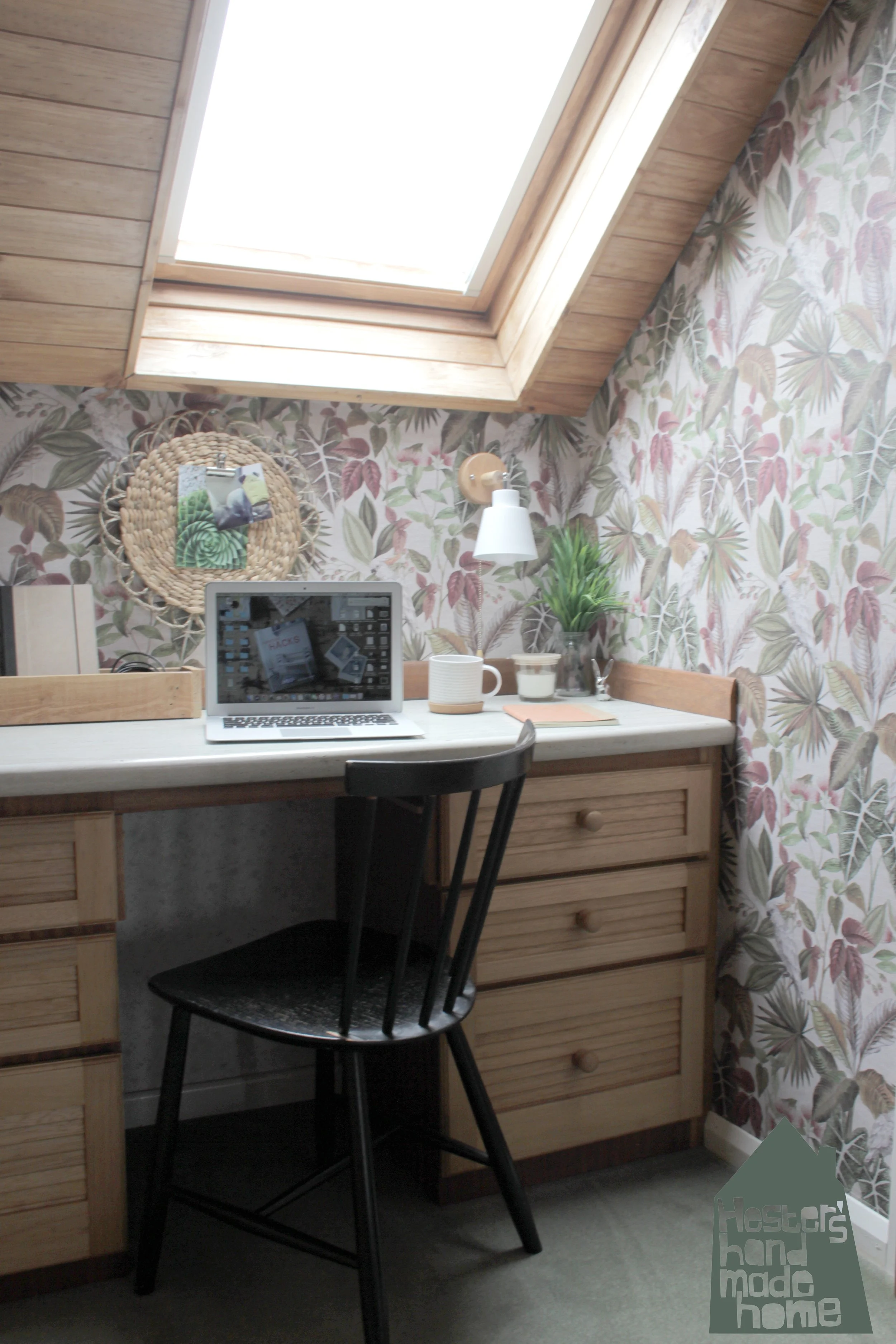
There is so much more to show you, the curtains, the bench I found in a vintage shop and made a new cover for, the art, but this post is getting rather long. Let me leave you with a peek into my partners office. A corner sandwiched between the bedroom and bathroom. A place where he works , and games :) And has all his clothes so I thought as this is his spot he could choose the wallpaper. I was thinking of a neutral hessian style paper but he chose these amazing vintage birds, brilliant! I love how you get a glimpse of the bold pattern through the arch of the bedroom.
The wall art is just a woven placemat that hangs from a nail on the wall, I hot glued a clip to the placemat so you can attach notes or photos to the circle. A budget solution when I couldn’t find the right piece of art that is also very useful.
I love our new bedroom, it is so cozy and I think the old floor looks really good now. Maybe in the future I will change it for a woven seagrass or hessian square carpet but for now the pale avocado looks just right. What do you think?


